Wednesday, September 24, 2008

Stick to vinyl

I bought this little guy back from Amsterdam as a present for my girlfriend.


I found him in Outland Records on Zeedijk, a record and vinyl character shop with a small gallery of sticker and street art downstairs in the basement. He comes from the set of Wookie/Crazy Label toys made for Chinese artist Bubi Au Yeung’s children's book “Treeson & Other Stories” (我愛樹仔)


Some of the work on display was from artists who have spoken in Dublin at Candy's SweetTalk shows over the last couple of years. Jon Burgerman had some pieces on show in the Outland gallery; his SweetTalk presentation a year or two ago was one stood out for me from all of those I've gone along to.

Some of the other artists on show:
Nagi Noda
Rolito
Superdeux
Tado

Free Papers

Some free Dutch arts newspapers picked up from the Brakkegrond Cultuurhuis, which is tucked away down an unassuming sidestreet named Nes, just off the Dam Square. I like the way the first two examples use two inks (yellow/black and magenta/black) with such striking effect. Again I feel the handling of typography across these covers was very crisp.


Tuesday, September 23, 2008

The Ajax Crest

Ajax play in one of the most distinctive strips in football; alongside such evocative and recognisable colours as the yellow, blue and white of Brazil, the Blue/Black-Red/Black stripes of Inter and AC Milan, the green and white hoops of Celtic, and the 'Oranje' of the Dutch national side themselves.


The story behind the development of the club crest is an interesting one. The first versions (1+2, see below) of the early 1900s featured a player in the team strip; this was originally red and white striped but had to be changed after the club's first promotion to the Dutch top flight. This was due to the fact that Sparta Rotterdam, already there, sported an identical kit. A revision was ordered by the Dutch FA, and so the distinctive, broad red band on white jerseys with white shorts and socks has been worn by the club ever since.

In 1928 the crest was changed (3) to an image of Ajax The Great, a hero of Greek Mythology famed for his strength and skill. This badge became an iconic symbol of the club and its values, but a redraw (4) of the famous figure in 1990 was unpopular and caused dismay among large groups of the support. Amongst other protests, a campaign named 'Geef Ajax z'n Gezicht Terug!' (Give Ajax it's face back!) demanded a return to the old design.

Perhaps the modern crest, used ever since, was a pioneering example of the development and modernisation of many football crests in recent years (Arsenal, below, would be another example. They simplified their crest in 2002: the earlier versions incorporated the coat of arms of the Islington borough of North London, the club's home) The new Ajax crest leaned towards concept more common to the graphic designer than the football fan: the key to the redraw was the fact that the face of the Greek hero was painted with 11 lines, representative of the 11 players in the team.


Ajax!

Paid a visit to the Amsterdam ArenA on Wednesday morning. Ajax were going down the road to Rotterdam to meet Feyenoord in the Eredivisie’s ‘Klassieker’ that coming Sunday morning; a game which ended 2-2.


The museum at the stadium is packed full of brilliant memorabilia collected down the years, particularly from the club’s indelible involvement in European competion. This wouldn’t be hard to come by for a club that has won the European Cup four times (having been beaten in another two finals), as well as one UEFA Cup, one Cup Winners' Cup (losing one other final), 2 Intercontinental Cups and 2 UEFA Super Cups.


If it ain’t Dutch it ain’t much*… pt 2


A few flyers that caught my eye. Cyan and Magenta overprinted on cheap and cheerful flimsy brown packaging paper... fluorescent inks and wonky trapping... unusual abstract imagery and photography.

If it ain’t Dutch it ain’t much*… pt 1

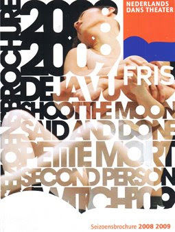
*A saying of my old mate, Peter Van Den Berg of Skills Netherlands. The quality, quantity and diversity of graphic design and printed material that surrounds you in the two cities I visited was incredible. Here are a some covers of several theatre guides/listings magazines picked up at the big discount ticket office at the Stadsschouwburg. Simple and clean use of san-serif type, and interesting print finishes (Rozen: gorgeous metallic red logotype and edging that appears black here but take my word for it) and binding (Toneelgroep: glued crudely down open spine)


Office no. 3

It wasn’t all fun and games, there was of course the week’s Upstarts project to think about. So here’s the proof: working on last weeks’s Dynamo/Itsa Bagel brief in Amsterdam's stunning Centrale Bibliotheek, a 5 minute stroll across the boardwalk beside Centraal Station. It is a spectacular building - free to wander in to and explore - and is apparently the largest public library in Europe.


Never, Netherlands

I spent a brilliant four days last week in Holland, two nights in Amsterdam and two nights in Rotterdam. It is the first time I have visited the country. The two cities are very different in both appearance and feel, but are both fantastic. I flew to Charleroi Airport outside Brussels on a cheap Ryanair flight (€30). From here it is possible to get a regular town bus down to the train station for €2.50, and a train straight to Amsterdam Centraal via Brussels Midi for €27 (U26/youth fare). The whole journey took about 4 hours, with a half hour wait and time for a coffee in Brussels; direct fares to Amsterdam from Dublin that day would have cost way, way more. That time flies anyway as you cross the region; the sprawling factories, yards and quaint, quiet towns of the Belgian countryside and the windmills, waterways and endless fields of the neighbouring Netherlands. Then, via Rotterdam, Den Haag, Lieden and Schipol... you get to Amsterdam. And things are never the same again.