*A saying of my old mate, Peter Van Den Berg of
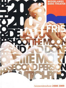
Skills Netherlands. The quality, quantity and diversity of graphic design and printed material that surrounds you in the two cities I visited was incredible. Here are a some covers of several theatre guides/listings magazines picked up at the big discount ticket office at the
Stadsschouwburg. Simple and clean use of san-serif type, and interesting print finishes (
Rozen: gorgeous metallic red logotype and edging that appears black here but take my word for it) and binding (
Toneelgroep: glued crudely down open spine)


No comments:
Post a Comment